
How A Tiny Spoonful Can Know The Whole Pot
Last Updated on July 23, 2026 by Editorial Team
Author(s): Kamrun Nahar
Originally published on Towards AI.
Sampling And Sampling Bias For Beginners
Here is a secret. You already understand sampling. You do it every time you cook.
You do not drink the entire pot to check if the soup needs salt. You give it a stir, you lift one spoonful, and you decide. That single spoon just spoke for two liters of dinner. If you stirred well, the spoon is honest. If you scooped only from the top where the salt never reached, the spoon lied, and your guests will suffer.
That is the entire field of sampling in one sentence. And that lying spoon is the thing we are here to hunt. It has a name. Sampling bias.
I learned this the hard way years ago, staring at a survey result at 11pm with a dog barking at something outside, convinced my data was gold. It was not gold. It was a spoon from the top of the pot.


First, the two words that carry the whole idea
Two words. Population and sample. Learn these and half the battle is already yours.
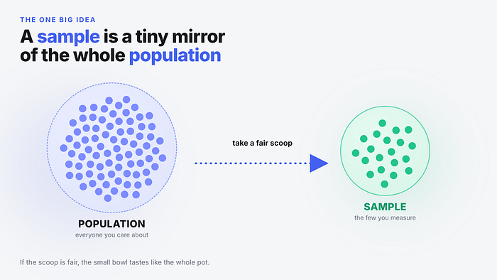
The population is everyone or everything you actually care about. Every voter in a country. Every user of your app. Every packet of chips leaving a factory. It is the full pot. Notice that population does not always mean people. In statistics it means the complete set of things your question is about.
The sample is the small handful you actually measure. You almost never get the whole population. It is too big, too expensive, too slow, or already partly gone. So you grab a sample and you hope it behaves like a tiny mirror of the whole thing.
Then you do the magic trick. You look at the sample and you make a claim about the population. That leap has a fancy name. Inference. You infer the big truth from the small handful.
Here is the boring but load bearing detail. Between the population you care about and the sample you measure, there is a bridge called the sampling frame. The frame is the actual list you can reach. Your phone contact list. Your email database. The people walking past your booth. And that bridge is exactly where things start to crack.

If you cannot name your population out loud before you collect a single data point, you are not doing research. You are collecting a pile of numbers and hoping they mean something. Naming the population first is the cheapest insurance in all of statistics.
So what exactly is sampling bias
Sampling bias is what happens when your sample is not a fair mirror of your population. Some groups get counted too much. Others barely show up, or vanish completely. The mirror is warped, so the reflection is warped, and every conclusion you draw is warped along with it.
Say it plainly. Bias is a systematic tilt, not bad luck.
That word systematic is the whole point. Random noise is fine. If you flip a fair coin ten times you might get six heads, and nobody panics, because more flips fix it. Bias is different. Bias does not wash out with more data. It leans the same wrong way every single time, and a bigger sample just leans harder.
Picture two scoops from the same crowd. One respects the real mix of people. One is drowning in a single group. Both feel like data. Only one tells the truth.

And where does the tilt sneak in? Usually at the bridge. You want everyone, you can only reach some, and only a slice of those actually reply. Each layer quietly drops people, and the people it drops are rarely a random bunch.

Bias is decided before you run any analysis. No clever model, no p-value, no neural network can un-warp a warped mirror. Garbage in stays garbage in, it just wears a nicer suit on the way out.
The greatest data mistake ever printed
Let me tell you about 1936. It is the story every statistics teacher tells, and for good reason.
A magazine called The Literary Digest ran a poll to predict the US presidential election. These people were not amateurs. They had called the last several elections correctly. This time they went enormous. They mailed out around ten million ballots. About 2.4 million came back. That is not a typo. Two point four million responses.
They looked at that mountain of data and declared the winner would be Alf Landon in a landslide.
Franklin Roosevelt then won one of the biggest landslides in American history. The other direction. It was so wrong the magazine folded not long after.
So what happened? Their mailing list came from telephone directories, car registration records, and their own subscribers. In 1936, in the middle of a brutal depression, who owned a phone and a car and a magazine subscription? Wealthier people. And wealthier people leaned toward Landon. The frame was tilted from the first envelope.
Here is the part that still gives me goosebumps. A young pollster named George Gallup predicted the correct result using a sample of only about fifty thousand people. Fifty thousand honest picks crushed 2.4 million tilted ones.


This is the myth killer. We treat huge numbers as proof. Size feels like safety. But a big biased sample is not a safer bet, it is a louder wrong answer. Which brings us to the single most expensive belief in data.
The myth that bigger always wins
People assume that if you just collect enough data, bias cancels out. It does not. Let me separate two ideas that beginners always blend together.
Noise is random scatter. Small samples are noisy. Add more data and the noise shrinks, your estimate settles down and stops bouncing around. This is real and useful.
Bias is a fixed lean. More data does nothing to bias. If your scoop always over-picks one group, ten times more of that scoop just gives you a very precise, very confident, very wrong number.
Think of a dartboard. A small fair sample is a few darts scattered loosely around the bullseye. A giant biased sample is a tight, beautiful cluster of darts, all landing in the top corner, nowhere near the center. Tight does not mean correct. Precise does not mean accurate.


When someone waves a giant dataset at you as if the size alone proves the point, that is your cue to ask how the data was collected. The how beats the how many. Every time.
The way to do it right, chance does the choosing
If bias comes from tilted picking, the cure is to remove your own hands from the picking. Let chance decide. This whole family is called probability sampling, and its defining trait is simple. Every unit in the population has a known, nonzero chance of being selected.
The opposite family is non-probability sampling, where you grab whoever is convenient or whoever volunteers. That family is where most bias is born.

Inside the good family there are four workhorses. Let me give you all four fast.
Simple random sampling. Names in a hat, draw at random. Everyone has an equal shot. Clean and beautiful, though hard when your population is truly gigantic.
Systematic sampling. Line everyone up and take every k-th person. Every 10th name on the list. Cheap and easy, as long as the list has no hidden repeating pattern that lines up with your interval.
Stratified sampling. Split the population into meaningful groups first, called strata, then sample fairly from each. If your city is 90 percent renters and 10 percent owners, you make sure your sample is too. This is the pro move for making sure no group gets erased.
Cluster sampling. Split the population into groups, then randomly pick whole groups and measure everyone inside. Great when people are naturally bunched, like sampling entire schools instead of scattered students across a country.

You do not need to memorize these like vocabulary for a test. You need to recognize that a fair method exists and was chosen on purpose. When a study says how it sampled, trust rises. When it stays silent, assume convenience, and assume tilt.
Let us actually see bias happen, in Python
Talk is cheap. Let us build a fake city and watch a biased sample fail in real numbers. Do not worry if you have never written code. I will explain every single piece right after, in human words.
We will make a city of one million adults. Most earn a normal wage. A small rich group earns a lot. Then we will estimate the average income two ways. One biased, one fair. Watch what happens.
import numpy as np
rng = np.random.default_rng(42)
#
N_NORMAL = 900_000
N_RICH = 100_000
normal = rng.normal(45_000, 12_000, size=N_NORMAL)
rich = rng.normal(250_000, 60_000, size=N_RICH)
city = np.concatenate([normal, rich])
truth = city.mean()
#
rich_ids = rng.choice(np.arange(N_NORMAL, N_NORMAL + N_RICH), size=800)
normal_ids = rng.choice(np.arange(0, N_NORMAL), size=200)
biased = city[np.concatenate([rich_ids, normal_ids])]
#
fair_ids = rng.choice(len(city), size=1000, replace=False)
fair = city[fair_ids]
#
print("true average ", round(truth))
print("biased estimate ", round(biased.mean()))
print("fair estimate ", round(fair.mean()))
Now the human translation, line by hungry line.
import numpy as np pulls in NumPy, a toolkit for crunching big lists of numbers fast. The as np part just gives it a short nickname so we type less. Small kindness to your own fingers.
rng = np.random.default_rng(42) creates a random number generator and hands it the seed 42. A seed is a starting point. Same seed means same random numbers every run, so you can repeat my result exactly. The number 42 is not magic, it is a nerd joke, pick any number you like.
N_NORMAL and N_RICH are just labels holding our two group sizes. The underscores in 900_000 are ignored by Python, they are there so your eyes can read nine hundred thousand without squinting.
rng.normal(45_000, 12_000, size=N_NORMAL) draws 900,000 incomes from a bell curve centered at 45,000 with a spread of 12,000. Most normal earners land near the middle. That is what normal means here, a normal distribution, the classic bell shape.
rich does the same trick for the wealthy, centered way up at 250,000. These are the people who will wreck a careless survey.
np.concatenate([normal, rich]) glues the two groups into one big array called city. Concatenate just means stick end to end. Now we have our full population, one million strong.
truth = city.mean() computes the real average income across the entire city. This is the answer we secretly know but a real researcher never would. It is our scorecard.
Now the biased scoop. Imagine we ran our survey outside a luxury shopping mall. rng.choice(...) picks random positions to sample. We pick 800 people from the rich range and only 200 from the normal range. That is backwards from reality, where the rich are the tiny minority. city[...] then looks up the actual incomes at those chosen positions. The result, biased, is a lopsided handful stuffed with wealthy shoppers.
The fair scoop is the fix. rng.choice(len(city), size=1000, replace=False) picks 1000 positions from the whole city, each with an equal chance. That replace=False part means once a person is picked they cannot be picked twice, no cloning the same guy. This is simple random sampling in one line.
print(...) just shows us the three numbers so we can compare.
Run it and you get something close to this.
true average 65500
biased estimate 210000
fair estimate 65400
Look at that. The true average sits around 65,500. The fair sample of just 1000 people nails it, landing near 65,400. The biased mall survey screams 210,000, more than triple the truth. Same city. Same math afterward. The only difference was who got scooped.
The biased sample was not broken because of a coding error or too little data. It was broken at the moment of selection. That is the fingerprint of sampling bias, the failure happens before the analysis, so the analysis cannot save you.
Now the fix, in code, using strata
Since we know the city is 90 percent normal earners and 10 percent rich, we can force our sample to respect that ratio. This is stratified sampling, and it is delightfully short.
n_total = 1000
n_normal = int(n_total * 0.90)
n_rich = n_total - n_normal
s_normal = rng.choice(np.arange(0, N_NORMAL), size=n_normal, replace=False)
s_rich = rng.choice(np.arange(N_NORMAL, N_NORMAL + N_RICH), size=n_rich, replace=False)
strat = city[np.concatenate([s_normal, s_rich])]
print("stratified estimate", round(strat.mean()))
Quick human read. n_total is our survey budget, 1000 people. int(n_total * 0.90) gives 900, the slots for normal earners, and int just chops it to a whole number since you cannot survey nine tenths of a person. n_rich takes whatever is left, 100. Then we pick each group separately with the right share and glue them together. The output lands back near 65,500, right on the truth, because we matched the sample shape to the real world on purpose.
Stratified sampling is your shield when a small but important group could otherwise get drowned out. It is the difference between a sample that happens to be fair and a sample that is built to be fair.
The many masks of sampling bias
Sampling bias is not one villain. It is a whole rogues gallery wearing different masks, all playing the same trick, letting some voices count more than others. Meet the usual suspects.

Undercoverage. Some group is missing from your frame entirely. Doing a phone survey but a chunk of your population has no phone. They cannot be picked, so their reality never enters your data.
Self-selection. People choose whether to be in your data, and the choosers are a special breed. Online reviews live here. The furious and the delighted write reviews. The vast contented middle just uses the thing and moves on. So the star rating is a tug of war between extremes, not a fair vote.
Convenience. You grab whoever is easy. Surveying your own followers, or the students in your own class, and then talking as if you speak for everyone.
Nonresponse. You picked a fair group, but only a certain type actually replied. We will give this one its own moment, because it is sneaky.
Survivorship. You only see the ones that made it. This one is so good it gets its own story next.
Healthy user. The people you can find are already the fit, active, engaged ones. Interview shoppers on a weekday afternoon and you overhear the retired and the flexible, not the person stuck at a desk until seven.
Here is a mundane one from my own life. For years I believed nobody replied to work emails quickly, until I realized I only ever noticed the slow ones because they were the ones I chased. The fast repliers were invisible to my memory. My brain was running a biased sample on itself.

The airplane story that rewires your brain
World War Two. American bombers are flying over Europe and coming back full of bullet holes. The military wants to add armor, but armor is heavy, so you can only reinforce a few spots. Where do you put it?
The obvious answer is to armor where the returning planes are most shot up. The engineers mapped every returning bomber, and the holes clustered on the wings, the tail, the body. Cover those, right?
A statistician named Abraham Wald, working with a research group at Columbia, said no. Put the armor where there are no holes. Around the engines. Around the cockpit.
Take a second with that, because it sounds insane at first.
Wald saw the trap everyone else missed. The data came only from planes that came back. That is the sample. The planes hit in the engines and cockpit did not come back, so they were never in the room to be counted. The holes on the survivors marked the survivable spots. The clean spots on the survivors marked the deadly ones. The missing planes were screaming the answer, and no one could hear them because they were missing.

This same ghost haunts modern advice. People point at college dropouts who became billionaires and conclude that dropping out is a smart bet. That is Wald’s plane all over again. You are looking only at the survivors. The millions who dropped out and struggled are the planes that never came back, quietly deleted from the story before it reaches you.
Here is a stranger one I love. A vet study once found that cats falling from higher floors seemed to get hurt less than cats falling from mid floors. Sounds impossible. The likely twist, cats that fell from very high and died were often not carried to the vet at all, so they never entered the data. The sample was only the cats that survived the trip to the clinic. Survivorship bias, with whiskers.
Why this matters. Train yourself to ask one haunting question of any dataset. Who is missing from this. The people, planes, cats, and companies that did not make it into your sample are often carrying the most important part of the answer.
Nonresponse bias, the quiet killer of surveys
Let us zoom in on nonresponse, because it fools even careful people who did everything else right.
You can choose a perfectly fair, random group to invite. Textbook clean. But you do not control who replies. And the people who bother to reply are almost never a random slice of the people you invited.
Imagine you invite 100 fair, random people. Twenty eight answer. Those 28 are not a mini version of the 100. They skew toward the folks with strong opinions, spare time, or big feelings about your topic. The 72 who ghosted you were busier, or calmer, or simply did not care, and their silence is data you just threw away.

This is why a low response rate is a warning light, not a rounding error. A survey with a 5 percent response rate is not a small version of a good survey. It is a portrait of the 5 percent who felt like talking.
Reddit is a living museum of this. Every thread that starts with “does anyone else” is a self-selected sample of people who felt the thing strongly enough to click. Scroll r/dataisbeautiful or r/statistics and you will watch this exact fight play out weekly, someone posts a chart from an online poll, and the top comment gently asks who actually answered it. That comment is usually right.

Chasing nonresponders is unglamorous and annoying and absolutely worth it. Following up with the silent group, even a random subset of them, tells you whether they differ from the talkers. If they do, you have caught the bias before it published a lie.
Interesting facts to keep in your back pocket
A few things that stuck with me, useful for winning arguments at dinner.
- Gallup rose to fame by beating a 2.4 million ballot poll with about 50,000 people in 1936, then famously got the 1948 election wrong himself, partly by stopping too early and leaning on quota sampling. Even the person who solved the problem got bitten by it later. Humbling.
- The classic “average income” trick. If a billionaire walks into a small bar, the average net worth in the room becomes millions, yet not one regular got a cent richer. Averages built on skewed samples are professional liars.
- Nielsen built a media empire on sampling. For decades what counted as a hit TV show was decided by measurement boxes in a few thousand homes, standing in for a whole nation. Get that sample wrong and shows lived or died on tilted data.
- Old buildings are not proof that people built better long ago. The flimsy old buildings already fell down. You are admiring the survivors. Same for old music sounding better, the forgettable songs were, well, forgotten.
How to starve the bias, a field kit
You cannot always kill sampling bias completely. But you can starve it until it barely matters. Here are the five moves I run through, in order, every time.

- Define who counts. Write down your exact population before you collect anything. This one sentence prevents a shocking number of disasters.
- Fix your frame. Check that your list can actually reach every group, not just the easy ones. Ask who is structurally locked out.
- Let chance choose. Use random or stratified selection. Never “whoever replied first” or “whoever was nearby.”
- Chase nonresponders. Follow up hard, and compare late repliers to early ones. If they differ, your bias is showing.
- Weight and sanity check. Compare your sample makeup to known totals from a census, sales records, or server logs, and re-weight to fix gaps. Then say the magic question out loud. Who is missing from this data.
Here is a tiny ASCII cheat sheet you can screenshot.
+-----------------------+--------------------------------+
| SMELL | LIKELY BIAS |
+-----------------------+--------------------------------+
| picked whoever came | convenience / self-selection |
| a group cannot be | undercoverage |
| reached at all | |
| low reply rate | nonresponse |
| only the winners are | survivorship |
| in the data | |
| huge sample, no | frame bias hiding behind size |
| method stated | |
+-----------------------+--------------------------------+
A 30 second gut check for any statistic
You do not need a degree to catch most bad numbers. You need three questions. Run them fast, in order, and stop at the first red flag.

Did chance pick the sample. Is every group actually in the list. Did most invited people respond. Three yeses and you can probably trust the number. One no and you slow down and ask harder questions before you believe a word.
That is it. That little flowchart has saved me from repeating more confident nonsense than I care to admit.
The one thing to carry home
Sampling is how we understand a world too big to measure fully. One honest spoonful can truly speak for the whole pot. That is not a trick, it is one of the most powerful ideas humans ever had.
But the spoon has to be honest. Sampling bias is the warped spoon, the tilted scoop, the survivors we mistake for the whole story. It fails quietly, before the math starts, which is exactly why it fools smart people with big datasets and fancy tools.
Join thousands of data leaders on the AI newsletter. Join over 80,000 subscribers and keep up to date with the latest developments in AI. From research to projects and ideas. If you are building an AI startup, an AI-related product, or a service, we invite you to consider becoming a sponsor.
Published via Towards AI
Towards AI Academy
We Build Enterprise-Grade AI. We'll Teach You to Master It Too.
15 engineers. 100,000+ students. Towards AI Academy teaches what actually survives production.
Start free — no commitment:
→ 6-Day Agentic AI Engineering Email Guide — one practical lesson per day
→ Agents Architecture Cheatsheet — 3 years of architecture decisions in 6 pages
Our courses:
→ AI Engineering Certification — 90+ lessons from project selection to deployed product. The most comprehensive practical LLM course out there.
→ Agent Engineering Course — Hands on with production agent architectures, memory, routing, and eval frameworks — built from real enterprise engagements.
→ AI for Work — Understand, evaluate, and apply AI for complex work tasks.
Note: Article content contains the views of the contributing authors and not Towards AI.
Related posts
Recent Posts